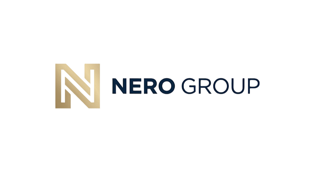
NERO GROUP
CI Brand Guide
Global Healthcare Business Platform.
This guide defines the visual identity, color palette, typography, and usage standards for NERO GROUP — a premium B2B healthcare & business agency platform under NERO GROUP.
Logo
Symbol Only
Solo usage on avatars, app icons, favicon
Primary Lockup
Horizontal wordmark + tagline for headers
Reversed Lockup
Dark background usage
Stacked Lockup
Vertical usage on business cards, signage
Logo Applications
Light Background
Dark Background
Small Scale (80px)
Symbol Concept
Letter N
The ascending diagonal and vertical strokes form the letter N, representing NERO GROUP identity and upward momentum.
Global Node
The gold circle at the tip symbolizes a network hub — the interconnected platform connecting healthcare, business, and global partners.
Connection
The small line extending from the node suggests reach, expansion, and premium partnership across borders.
Premium Minimalism
Clean geometric lines avoid decorative excess. The symbol reads clearly at 16px on mobile and 4m on signage.
Color Palette
Primary Colors
Deep Navy
#0A243F
Primary brand color. Headers, primary CTAs, key UI elements, footer base.
Navy 400
#0D2E4F
Hover states, secondary accents, icon lines, borders.
Champagne Gold
#D5BF92
Premium highlights, tags, active states, metric emphasis, symbol node.
Neutral Colors
Warm Ivory
#F8FAFC
Main page backgrounds, creating warmth and premium feel.
Soft Cream
#F0F4F8
Alternate section backgrounds, card fills.
Warm Charcoal
#2A2F36
Primary body text, headings, dark sections.
Stone
#D1D9E4
Dividers, borders, subtle separators, inactive tabs.
Typography
H1 — Hero
48px / 56px · Weight 500
Line 1.08 · Tracking -0.02em
Global Business Agency
H2 — Section
36px / 44px · Weight 500
Line 1.12 · Tracking -0.02em
Our Services
H3 — Sub-section
22px / 28px · Weight 500
Line 1.25 · Tracking -0.01em
Healthcare Consulting
Body
15px / 17px · Weight 400
Line 1.75 · Tracking 0
NERO GROUP integrates healthcare consulting, medical tourism operations, and K-beauty device distribution into a unified global healthcare business group.
Caption / Label
11px / 12px · Weight 500
Line 1.4 · Tracking 0.12em
GLOBAL PARTNERSHIP
Nav / UI
13px · Weight 400
Line 1.5 · Tracking 0.01em
Services Group Contact
Updated Typography Standards
The live site uses updated standards: body text at 16px minimum, headings at 600–700 weight, line-height at 1.6, and darker body color (#2A2F36). See the fullDesign System for details.
UI Components
Primary CTA
Solid fill with Deep Navy (#0A243F). Used for primary actions: contact, inquiry, submit. Hover transitions to Navy 400.
Secondary CTA
Outline style with subtle border. Hover inverts to Charcoal fill. Used for secondary navigation and browsing.
Text Link
Read Full ReportInline text link with underline hover animation. Color shifts from Navy to Gold on interaction.
Label / Badge
Annual Report 2026Gold-tinted tag for categorization, status indicators, and content labels. Light background keeps it subtle.
Website Application
NERO GROUPGlobal Business Agency
Platform for Premium Healthcare
프리미엄 헬스케어 복합사업을 위한 글로벌 비즈니스 에이전시 플랫폼
헬스케어 컨설팅 & 전략
병원·클리닉·헬스케어 기업의 디지털 전환, 브랜드 전략, 수익모델 최적화, 해외 시장 진출 로드맵을 설계합니다.
Slogan Usage
Global Healthcare Business Platform
Primary slogan. Used under logo on headers, proposals, and investor decks.
Premium Healthcare & Business Agency
Secondary variant. Useful when emphasizing agency & consulting identity.
Integrated Healthcare Business Platform
Tertiary variant. Emphasizes the unified, all-in-one platform structure.
Usage Rules
Minimum Size
Symbol: 16px minimum. Wordmark: 18px minimum. Never use below these sizes to preserve legibility.
Clear Space
Maintain a clear space equal to the height of the symbol on all sides of the logo lockup.
Backgrounds
Use on light backgrounds (Ivory, White, Cream). On dark backgrounds, use the gold logo for premium presence.
Do Not Distort
Never stretch, rotate, add effects, or change logo colors outside the defined palette.
Tagline Pairing
Tagline always stays below wordmark. Font size 11px, tracking 0.08em, color Gold.
Icon Usage
Symbol alone is acceptable for favicons, app icons, social avatars, and small UI markers.
Brand Story & Mission
From Local Excellence to Global Standard
NERO GROUP was founded on the belief that premium Korean healthcare — from advanced health screening to world-class beauty and dermatology — deserves a global stage. We bridge the gap between Korea's leading medical institutions and international patients, partners, and healthcare businesses.
Starting as a specialized healthcare consulting firm, we have evolved into a comprehensive global business agency that integrates K-healthcare, K-beauty, medical device distribution, complex facility development, and hospital operating system export into a unified platform.
Mission
To deliver premium Korean healthcare solutions globally through integrated business platforms, strategic partnerships, and world-class patient experiences.
Vision
To become the leading global healthcare business agency that defines the standard for cross-border medical tourism, beauty consulting, and healthcare facility management.
Values
Excellence · Trust · Innovation · Global Integration · Patient-First
Premium Quality
Every service, product, and partnership meets the highest standards of Korean healthcare excellence.
Global Reach
Connecting local expertise with international markets through localized operations and cultural fluency.
Integrated Solutions
One platform that covers consulting, operations, facility development, and system export end-to-end.
Grid & Spacing System
| Property | Value | Usage |
|---|---|---|
| Container Max-Width | 1440px | Main content wrapper for all pages |
| Content Max-Width | 1200px | Text-heavy sections (about, governance, etc.) |
| Narrow Max-Width | 960px | Reading-focused content (insights, articles) |
| Grid Columns | 12 columns | Desktop layout with 24px gutters |
| Gutter | 24px | Space between grid columns on desktop |
| Mobile Gutter | 16px | Space between grid columns on mobile |
Spacing Scale
space-1
Icon padding, micro gaps
space-2
Tight element spacing, inline gaps
space-3
Small component padding
space-4
Card padding, section inner gaps
space-5
Medium gaps, form field spacing
space-6
Section padding, grid gutters
space-8
Large component gaps, card margins
space-10
Section vertical spacing
space-12
Major section breaks
space-16
Hero section padding, page breaks
space-20
Large page section dividers
space-24
Extra large section padding
12-Column Grid Visualization
12-column grid with 24px gutters. Columns scale proportionally on smaller screens.
Icon System
NERO GROUP uses the Remix Icon library (ri-* classes) for all UI icons. Icons are used in line style (outlined) at 16px, 20px, and 24px sizes. Solid fill is reserved for active states only.
Navigation
Primary nav, mobile hamburger, dropdown triggers
ri-menu-lineArrow
CTA links, "learn more", directional indicators
ri-arrow-right-lineDownload
File downloads, PDF export, asset access
ri-download-lineExternal
External links, new tab indicators
ri-external-link-lineCheck
Success states, completed items, verified badges
ri-check-lineInfo
Tooltips, help text, contextual notices
ri-information-lineCalendar
Scheduling, events, date pickers
ri-calendar-lineUser
Profile, account, login, personnel
ri-user-lineSearch
Search bars, find functionality, discovery
ri-search-lineEmail, contact, newsletter, notifications
ri-mail-linePhone
Contact numbers, call-to-action, telehealth
ri-phone-lineMap
Location, addresses, facility locators
ri-map-pin-lineSize Standards
Use 16px for inline text, 20px for buttons and nav items, 24px for standalone UI elements. Never scale below 16px to maintain legibility.
Color Usage
Default: Charcoal (#2A2F36) at 70% opacity. Hover: Gold (#D5BF92). Active: Navy (#0A243F). Disabled: Charcoal at 30%.
Spacing
Always pair icons with 8px gap to adjacent text. Icon containers should be square (w-10 h-10) for touch targets.
Photography Style
Clean, Premium, Human
NERO GROUP photography communicates trust, precision, and warmth. Every image should feel like a premium healthcare experience — clean environments, confident professionals, and natural patient moments.
- Use natural, soft lighting that conveys warmth and trust
- Show real healthcare professionals and genuine patient interactions
- Keep backgrounds clean and uncluttered (white, ivory, or soft neutrals)
- Feature modern, premium medical facilities and equipment
- Include diverse patient demographics for global appeal
- Use overly dramatic or dark lighting that feels clinical or cold
- Show outdated medical equipment or poorly maintained facilities
- Use stock photos that feel generic or inauthentic
- Apply heavy filters or unnatural color grading
- Include cluttered backgrounds or distracting visual elements
Approved Subject Categories
Facilities
Modern clinics, screening centers, wellness facilities, hospital interiors
Procedures
Non-invasive treatments, consultations, beauty procedures, health screening
People
Professional staff, satisfied patients, international visitors, partners
Lifestyle
Korean culture, travel, wellness routines, Seoul cityscapes (subtle)
Print Templates
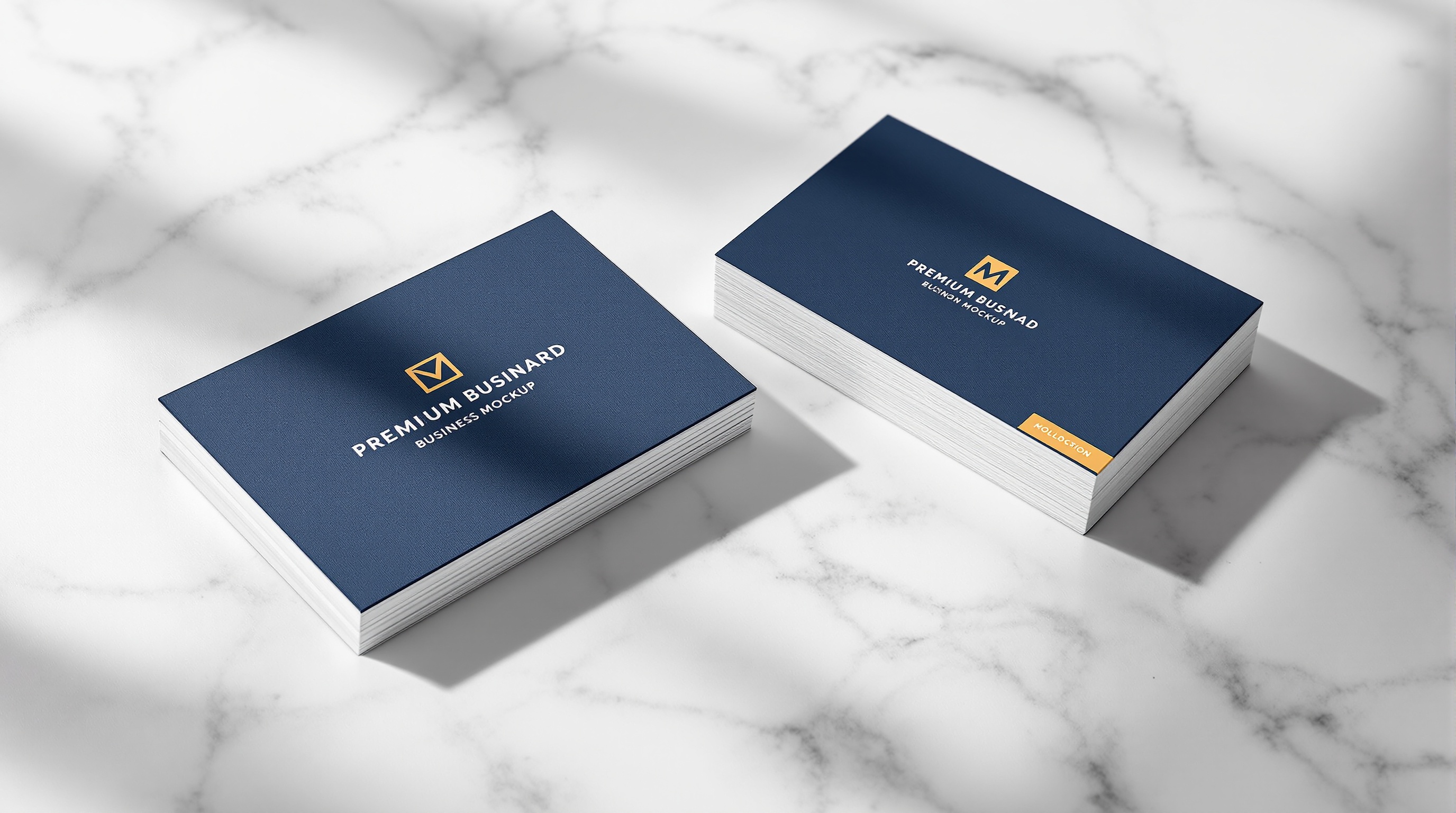
Size: 90mm × 55mm
Paper: 350gsm matte coated, soft touch
Color: Deep Navy front, Ivory back with gold foil logo
Size: 220mm × 110mm (DL)
Paper: 120gsm uncoated, premium feel
Color: Deep Navy with gold foil logo seal
Ratio: 16:9 (1920 × 1080px)
Background: Deep Navy with gold accent
Layout: Logo centered, title in Ivory
Size: A4 (210mm × 297mm)
Cover: 300gsm matte with gold foil
Layout: Logo top, title centered in Ivory
Gangnam-gu, Seoul, South Korea · contact@neroplusglobal.com
Size: A4 (210mm × 297mm)
Paper: 120gsm uncoated, premium feel
Header: Logo + wordmark in Charcoal, 12mm margin
Social Media Templates
Social media templates maintain brand consistency across all platforms. Use the approved layouts below for Instagram, LinkedIn, and other channels. Never deviate from color palette or typography.
1080 × 1080px
Logo centered, gold accent, minimal text overlay
1584 × 396px
Dark background with logo and tagline
1080 × 1920px
Vertical format, logo at top, clean layout
Email Design
Width: 600px (max for email clients)
Header: Logo + newsletter tag in Gold
CTA: Navy button, full-width on mobile
James Kim
Director of Global Partnerships
NERO GROUP
contact@neroplusglobal.com
+82 2-1234-5678
www.neroplusglobal.com
Logo: 32px symbol, left-aligned
Text: 13px, Charcoal, with Gold role line
Divider: 1px Stone line before contact info
Motion & Animation
Animations in NERO GROUP digital products should feel premium, smooth, and purposeful. Every motion should guide the user, not distract them. Subtlety is key.
ease-smooth
cubic-bezier(0.4, 0, 0.2, 1)General transitions (default)
ease-enter
cubic-bezier(0, 0, 0.2, 1)Elements entering viewport
ease-exit
cubic-bezier(0.4, 0, 1, 1)Elements leaving viewport
ease-bounce
cubic-bezier(0.34, 1.56, 0.64, 1)Playful micro-interactions only
Fast
150ms
Hover states, micro-interactions
Normal
300ms
Standard transitions, reveals
Slow
500ms
Page transitions, large elements
Dramatic
800ms
Hero animations, special moments
Use fade + translate for most entrances (not scale)
Stagger child elements by 50–100ms for sequential reveals
Never animate layout properties (width, height) — use transform only
Respect prefers-reduced-motion for accessibility
Hero animations should be under 1.5s total duration
Voice & Tone
NERO GROUP communicates as a premium, global healthcare business partner. Every piece of content — from website copy to partner emails — should reflect this voice consistently.
Professional
Expert-level language that demonstrates deep industry knowledge. Avoid jargon unless targeting specialists.
"We operate an integrated healthcare business platform connecting Korean medical excellence with global markets."
Trustworthy
Clear, honest, and transparent. Never overpromise. Facts and credentials speak louder than adjectives.
"Our partner hospitals are KHDA-certified with over 15 years of international patient experience."
Global
Culturally aware and inclusive. Content should resonate across Korea, China, Southeast Asia, and the Middle East.
" localized care coordination in Mandarin, English, and Arabic ensures seamless patient journeys."
Premium
Elevated but never arrogant. Use refined language that reflects quality without being ostentatious.
"Experience personalized healthcare journeys designed for discerning international patients."
Website / Public
Confident, inviting, informative
Balance professionalism with accessibility. Use active voice and clear CTAs.
Partner Portal
Direct, technical, efficient
Assume business knowledge. Use precise terminology and structured data.
Patient-facing
Warm, reassuring, empathetic
Healthcare is personal. Use comforting language and clear next steps.
Investor / B2B
Strategic, data-driven, ambitious
Focus on growth metrics, market expansion, and ROI. Use industry benchmarks.
Social Media
Approachable, engaging, visual
Shorter sentences, emoji restraint, strong visual hooks. Humanize the brand.
Use These
Avoid These
Download Assets
Download official brand assets for partners, agencies, and internal teams. All files follow the brand guidelines defined in this guide.
Logo PNG
PNGOfficial NERO GROUP logo in transparent PNG format
24KB
CI Guide PDF
PDFComplete brand guidelines and usage rules
2.4MB
Logo SVG
SVGVector logo for scalable usage
12KB
Business Card Template
PDFPrint-ready business card template (90mm × 55mm)
1.8MB
Envelope Template
PDFCorporate envelope template (DL size)
1.2MB
PPT Template
PPTXPowerPoint presentation cover template (16:9)
3.5MB
Document Cover
PDFOfficial document cover template (A4)
1.5MB
Letterhead
PDFCorporate letterhead template (A4)
1.1MB
How to Add More Files
Place files in the public/assets/brand/ folder. Files are automatically detected and activated — no code changes needed. Supported file names: neroplus-ci-guide.pdf,business-card-template.pdf, etc.
NERO GROUPCI Brand Guide — NERO GROUP (NERO GROUP)
All brand assets, color codes, and typography specifications are proprietary and confidential.
For usage permissions, contact the NERO GROUP brand team.